Something Blue, An Art Exhibition… The notion is simple, an on-line curated art exhibition, a group show of artists and a carefully selected curated show united via the vague theme of “something blue”. A collection of painters, print makers, video makers, sculptors and more, a simple notion, please explore and enjoy (Sean Worrall, Cultivate, August 2017)
Click in an image to enlarge or to tun the slide show. We would like to think the show is worth viewing on a PC or larger computer monitor rather than a annoyingly small phone screen. Notes and links to the artists can be found at the foot of this page.
-
- Something Blue
-
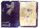
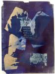
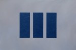
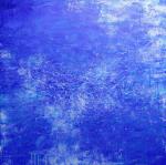
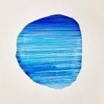
- 1; Artist: LAURA SCULL, Title: Cardiff II (2015) – Double print of a range of screen printed drawings and sample paint. Composed of about 6 different layers. (58cm x 63cm)
-
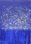
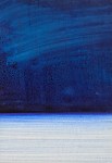
- 2: Artist: LAURA SCULL, Title: Untitled (2016) – Experimentation of techniques to create a textured layered surface 29.7cm x 42cm
-
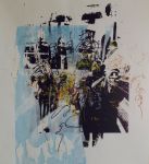
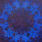
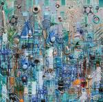
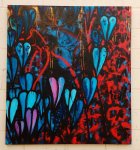
- 3: Artist: SZILVIA PONYICZKI, Title: Adventures in Perception II (2017) – acrylic painting on newspaper covered metal sheet. 60 x 60 cm
-
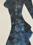
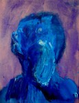
- 4:Artist: DAY BOWMAN, Title: Rear View Mirror 3 (2017), oil, charcoal and conte on canvas, 152 x 168 cm.
-
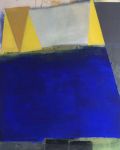
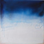
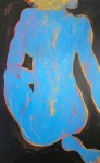
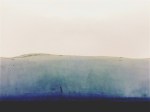
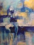
- 5: VERITY NEWMAN, Title: Circle (2016), Acrylic on canvas, 60 x 80cm
-
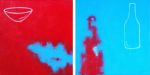
- 6: Artist: VERITY NEWMAN, Title: Blue Bowl on Red and Red Bottle on Blue (pair) 2015, Acrylic on canvas, 30cm x 30cm (each)
-
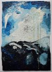
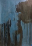
- 7: Artist: ANGELA McFALL, Title: Sargasso (2016), oil on canvas, 60cm x 60cm
-
- 8: Artist: ANGELA McFALL, Title: The Sea (2016), oil on canvas
-
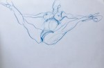
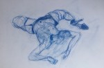
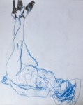
- 9: Artist: JANE DENMAN, Title: Chunky Move Light (2016), acrylic on canvas This painting is part of a dance and movement series
-
- 10:Artist: JANE DENMAN, Title: New Blue Dance (2016), acrylic on canvas, 100cm x 80cm – This painting is part of a dance and movement series
-
- 11: Artist: JANE DENMAN, Title: New Feeling (2016), acrylic on canvas. This painting is part of a dance and movement series
-
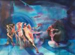
- 12: Artist: JANE DENMAN, Title: Quests Blue (2016), acrylic on canvas. This painting is part of a dance and movement series
-
- 13: Artist: JANE DENMAN, Title: Cuban (2015), acrylic on canvas (100cm x 80cm)
-
- 14: Artist: PHILL HOPKINS, Title: No.9 (Post Truth), 2016, Household paints and varnish and spray paint on Fabriano 100/100 cotton paper. 28.7 x 19.6 cm
-
- 15; Artist: PHILL HOPKINS, Title: Untitled (Mark Rothko by Hans Naumuth 1964) 2017, Paints, varnishes, drips, marks and studio debris on postcard 10.5 x 14.8 cm
-
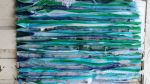
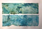
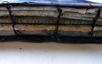
- 16: Artist: SHARLEENE OLIVIER, Title: Stormy Sea (2017), Paper, thread, 42cm x 60cm. Layers of paper stitched together, cut and re-stitched by hand to create a textured artwork
-
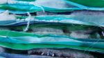
- 17: Artist: SHARLEENE OLIVIER, Title: Stormy Sea, detail (2017), Paper, thread, 42cm x 60cm. Layers of paper stitched together, cut and re-stitched by hand to create a textured artwork
-
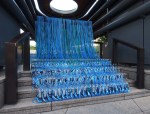
- 18: Artist: MARION JONES, title: Powder Blue (2016). Oil, acrylic, graphite and pigment on canvas, 102 x 76cm. Layers , edges, planes and geometric shapes.
-
- 19: Artist:SUSAN BANKS, Title: Persephone [Among Torches of Darkness] no 1 (2011), Oil paint on deep canvas, 60x60x4cm
-
- 20: Artist:SUSAN BANKS, Title: Persephone [Among Torches of Darkness] no 2 (2011), Oil paint on deep canvas, 76x76x4cm
-
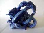
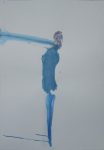
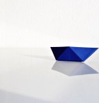
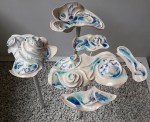
- 21: SIMON LE BOGGIT, Title: Tangled Up In Blue (2017). Three photos of a glazed ceramic sculpture, H 10cm x W12cm x D 10cm
-
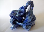
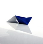
- 22: SIMON LE BOGGIT, Title: Tangled Up In Blue (2017). Three photos of a glazed ceramic sculpture, H 10cm x W12cm x D 10cm
-
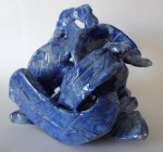
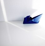
- 23: SIMON LE BOGGIT, Title: Tangled Up In Blue (2017). Three photos of a glazed ceramic sculpture, H 10cm x W12cm x D 10cm
-
- 24: Artist: EMILIE-CHRISTINE P. NEWMAN, Title: Mitailak (2013), Encaustic, stained glass, lightbox, 20cm x 25cm x 2.5cm. All three images are of the same piece, from different angles.
-
- 25: Artist: EMILIE-CHRISTINE P. NEWMAN, Title: Mitailak (2013), Encaustic, stained glass, lightbox, 20cm x 25cm x 2.5cm. All three images are of the same piece, from different angles.
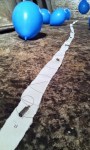
-
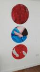
- 26: Artist: EMILIE-CHRISTINE P. NEWMAN, Title: Mitailak (2013), Encaustic, stained glass, lightbox, 20cm x 25cm x 2.5cm. All three images are of the same piece, from different angles.
-
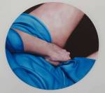
- 27: Artist: KRISTY CAMPBELL, Title: Artist Books, Assemblage (2014)
-
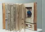
- 28: Artist: SUSAN WRIGHT, Title: Canticle for the Anthropecene (2017), Print – etching, monoprints and photolithography presented in the form of a bound book. 30cm x 40cm x 5cm
-
- 29: Artist: SUSAN WRIGHT, Title: Canticle for the Anthropecene (2017), Print – etching, monoprints and photolithography presented in the form of a bound book. 30cm x 40cm x 5cm
-
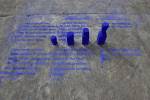
- 30: Artist: SUSAN WRIGHT, Title: Canticle for the Anthropecene (2017), Print – etching, monoprints and photolithography presented in the form of a bound book. 30cm x 40cm x 5cm
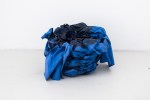
-
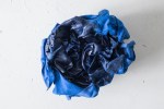
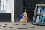
- 31: SEAN WORRALL, observations with a camera. A shot taken at A Fete Worse Than Death 2014, Rivington Street, East London, A 20th Anniversary Art extravaganza to commemorate the original Fete and to celebrate Joshua Compston
-
- 32: Artist: JOANNA LEAH, Title: It’s So Serious Doing The Twist (2016), Images from Diptych film presented at KTH Institute Stockholm.
-
- 33: Artist: JOANNA LEAH, Title: It’s So Serious Doing The Twist (2016), Images from Diptych film presented at KTH Institute Stockholm.
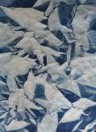
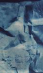
-
- 34: Artist: JOANNA LEAH, Title: It’s So Serious Doing The Twist (2016), Images from Diptych film presented at KTH Institute Stockholm.
-
- 35: Artist: JOANNA LEAH, Title: It’s So Serious Doing The Twist (2016), Images from Diptych film presented at KTH Institute Stockholm.
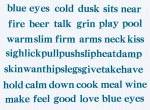
-
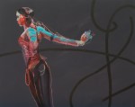
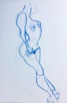
- 36: Artist: SUSAN PLOVER, Title: Blue For You (2017), Collage, 12.5 x 18cms
-
- 37; Artist: SUSAN PLOVER, Title: In my dreams (2017). Drawing; Paper on card. 18 x 12.5cm
-
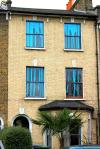
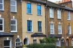
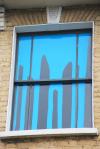
- 38: Artist: ALICE MARTIN, Title: AMO1 (2016), Digital art, 22 x 30cm
-
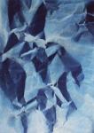
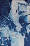
- 39: ZOOX, Title: float; (2017), Video – stills from video
-
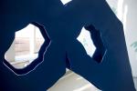
- 40: ZOOX, Title: float; (2017), Video – stills from video
-
- 41: ZOOX, Title: float; (2017), Video – stills from video
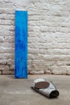
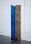
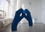
-
- 42: ZOOX, Title: float; (2017), Video – stills from video
-
- 43: Artist: MONICA GOLDSTEIN, Title: Book of Space. (artist book). Unique book.(1989), Altered book, 18 pages (collage, ink, colour pencils), 24 cm x 14 cm x 1 cm (closed).
-
- 44: Artist: MONICA GOLDSTEIN, Title: Subtle Geography Treaty (artist book) 1997, Unique Book. Altered book. Mixed media, 20 cm x 28 cm x 8 cm (closed).
-
- 49: Artist: MARK PARKINSON, Title: Untitled (2017), oil on mdf, 10 x 10 x 10cm
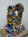
-
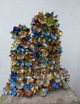
- 50: Artist: MARK PARKINSON, Title: Avenham Nights (2015), oil on canvas, 120 x 80 x 4cm
-
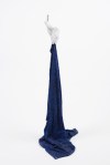
- 51: Artist: MARK PARKINSON, Title: On The Edge (2014), oil on canvas, 120 x 80 x 4cm
-
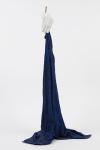
- 52: Artist: MARK PARKINSON, Title: Quite Before Dawn (2015), oil on canvas, 120 x 80 x 4cm
-
- 53: Artist: CATHERINE HIGHAM, Title: Hunshelf (Snow), 2015. Acrylic and oil on canvas, 61 x 61cm
-
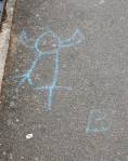
- 54: SEAN WORRALL, observations with a camera. A shot of a chalk drawing on a Hackney Pavement, June 2017. Artist unknown.
-
- 55: Artist: SANDRA BECCARELLI, Title: Mercurial Light (2016), Oil on linen, 40cm x 40cm
-
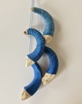
- 56: Artist: SANDRA BECCARELLI, Title: An Uncertain Place (2016), Oil on linen, 40cm x 40cm
-
- 57: Artist: ROBERT P. RYAN, Title: Covered (2017, oil on canvas, 30″ x 40″
-
- 58: Artist: WAYNE SLEETH, Title: Gulls (2013), acrylic and gloss paint on stretched canvas, 100 x 80cm
-
- 59: Artist: WAYNE SLEETH, Title: Gulls (2015), acrylic and gloss paint on stretched canvas, 80 x 80cm
-
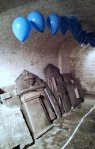
- 60: Artist: WAYNE SLEETH, Title: Gulls (2014), acrylic and gloss paint on stretched canvas, 100 x 100cm
-
- 61: Artist: WAYNE SLEETH, Title: Gulls (2016), acrylic and gloss paint on stretched canvas, 70 x 50cm
-
- 62: Artist: CHARLOTTE NICHOLSON, Title: Lady In Blue (2016), Polychromatic print, 69cm x 90cm
-
- 63: Artist: GEORGINA MAXWELL, Title: Toxic Ocean Blues (2013), Marine plastic bottle tops found on the shorelines of Cornwall, 43 x 36 x 7cm
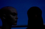
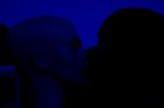
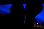
-
- 64: Artist: BEATA BURDELAK, Title: On View (2016), ink and acrylic on wood, carpet, tea and resin
-
- 65: Artist: BEATA BURDELAK, Title: Blue Bird (2015), resin, towels, size: Variable
-
- 66: Artist: BEATA BURDELAK, Title: Blue Bird (2015), resin, towels, size: Variable
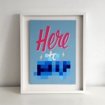
-
- 67: Artist: BEATA BURDELAK, Title: Would it have Been Worth it After All (2015), ink and acrylic on wood, cast iron
-
- 69: BEATA BURDELAK – Artist: BEATA BURDELAK, Title: Not Quite There
-
- 68: BEATA BURDELAK – Artist: BEATA BURDELAK, Title: Not Quite There
-
- 70: Artist: JOE JEFFORD, Title: 470-495 nm (2014), Cyanotype Print, 60cm x 85cm, Cyanotype prints are inherently linked with the colour blue. It was the first process used to created engineering blueprints
-
- 71: Artist: JOE JEFFORD, Title: 470-495 nm (2014), Cyanotype Print, 60cm x 85cm, Cyanotype prints are inherently linked with the colour blue. It was the first process used to created engineering blueprints
-
- 72: Artist: JOE JEFFORD, Title: 470-495 nm (2014), Cyanotype Print, 60cm x 85cm, Cyanotype prints are inherently linked with the colour blue. It was the first process used to created engineering blueprints
-
- 73: Artist: JOE JEFFORD, Title: 470-495 nm (2014), Cyanotype Print, 60cm x 85cm, Cyanotype prints are inherently linked with the colour blue. It was the first process used to created engineering blueprints
-
- 74: Artist: LINDA PARR, Title: Blue Eyes (2013), LetterMpress digital print, 36 x 26.5cm. Blue four-letter word poem
-
- 75; Artist: HEIDI WIGMORE, Title: Blue Movie (2017), Drawing on paper, 29cm x 42cm. An ongoing series of fast sketches from life, that make a looped slideshow-movie of performing strippers and pole dancers
-
- 76; Artist: HEIDI WIGMORE, Title: Blue Movie (2017), Drawing on paper, 29cm x 42cm. An ongoing series of fast sketches from life, that make a looped slideshow-movie of performing strippers and pole dancers
-
- 77: Artist: HEIDI WIGMORE, Title: Blue Movie (2017), Drawing on paper, 29cm x 42cm. An ongoing series of fast sketches from life, that make a looped slideshow-movie of performing strippers and pole dancers
-
- 78: Artist: HEIDI WIGMORE, Title: Blue Movie (2017), Drawing on paper, 29cm x 42cm. An ongoing series of fast sketches from life, that make a looped slideshow-movie of performing strippers and pole dancers
-
- 79; Artist: HARRIET HILL. Title: Big Drip (2013), hand-cut vinyl, Site-specific installation on the windows of a house.
-
- 80: Artist: HARRIET HILL. Title: Big Drip (2013), hand-cut vinyl, Site-specific installation on the windows of a house.
-
- 81: Artist: HARRIET HILL. Title: Big Drip (2013), hand-cut vinyl, Site-specific installation on the windows of a house.
-
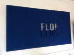
- 82: Artist: HARRIET HILL. Title: Flop (2016), canvas on timber, 170 x 92 x 7cm. Letters cut out of blue canvas mounted on timber frame
-
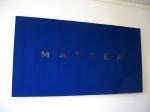
- 83: Artist: HARRIET HILL. Title: Matter (2016), canvas on timber, 170 x 92cm. Letters cut out of blue canvas mounted on timber frame.
-
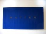
- 84: Artist: HARRIET HILL. Title: Matter (2016), canvas on timber, 170 x 92cm. Letters cut out of blue canvas mounted on timber frame.
-
- 85: Artist: CATHERINE RYAN, Title: Illuminati City (It’s OK Baby) 2011, Acrylic and mixed media on canvas, 82 x 82cm
-
- 86: Artist: JAWBONE JAWBONE, Title: Where? (2017), plywood, aeroply & varnish, H – 1m 20cm W – 1m 60cm D – 12cm.
-
- 87: Artist: JAWBONE JAWBONE, Title: Where? (2017), plywood, aeroply & varnish, H – 1m 20cm W – 1m 60cm D – 12cm.
-
- 88: Artist: HEATHER BOXALL, title: Blue Icon (2015), oil on gesso on board, 30cm x 30cm
-
- 89: Artist: HEATHER BOXALL, title: marion blue l (2015-16), oil on gesso on board, 30cm x 25cm
-
- 90: Artist: HEATHER BOXALL, title: marion blue ll (2015-16), oil on gesso on board, 30cm x 25cm
-
- 91: Artist: HEATHER BOXALL, title: marion blue lll (2015-16), oil on gesso on board, 30cm x 25cm
-
- 92: Artist: AMANDA WATT, title: Blue nude. Acrylic on board, 8”x5”
-
- 93: Artist: ANDREW LITTEN. Title: Nothing Matters (2017), oil on board, 45x60cm
-
- 94: Artist: ANGELA READ. Title: Three Towers (2015). Process based work made from discarded aluminium drinks cans which have been manipulated into an origami shape.
-
- 95: Artist: ANGELA READ. Title: Three Towers (2015). Process based work made from discarded aluminium drinks cans which have been manipulated into an origami shape.
-
- 96: Artist: ANDREW LITTEN. Title: Man (Standing) 2017, 100 x70cm, mixed media on paper
-
- 97: Artist: ALEXANDER GLASS, title: ‘…and then the towel fell to the floor’ (2015), jesmonite, steel, resin coated towel, 100 x 40 x 50 cm
-
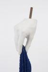
- 98: Artist: ALEXANDER GLASS, title: ‘…and then the towel fell to the floor’ (2015), jesmonite, steel, resin coated towel, 100 x 40 x 50 cm
-
- 99: Artist: ALEXANDER GLASS, title: ‘…and then the towel fell to the floor’ (2015), jesmonite, steel, resin coated towel, 100 x 40 x 50 cm
-
- 100: Artist: BARBARA BRYN KLARE, Title: Blue Rock Medium: Ink on paper, 8 x 9 inches
-
- 101: Artist: BARBARA BRYN KLARE, Title: Blue Horizon Medium: Gouache and ink on paper, 18 x 24 inches
-
- 102: Artist: BARBARA BRYN KLARE, Title: Indigo Landscape, Medium: Filtered indigo-dyed paper, 18 x 24 inches
-
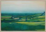
- 103: Artist: CAIT SWEENEY, Title: View From A Hill, Brill, Bucks. Oil on board, 129x90cm
-
- 104: Artist: DARIA WAWRZKIEWICZ, Title: ‘Drifting’, paper/sculpture performance with light 6am.
-
- 105: Artist: DARIA WAWRZKIEWICZ, Title: ‘Drifting’, paper/sculpture performance with light 6am.
-
- 106: Artist: DARIA WAWRZKIEWICZ, Title: ‘Drifting’, paper/sculpture performance with light 6am.
-
- 107: Artist: BARBARA BRYN KLARE, Title: Rams Horns Medium: Icelandic ram horn cartilage, indigo-dyed thread, 20 x 10 inches
-
- 108: Artist: DEB COVELL, Title: Blue Pleat (2017), Acrylic paint, car lacquer, 16×24 cm
-
- 109: Artist: DEB COVELL, Title: Blue Pleat (2017), Acrylic paint, car lacquer, 16×24 cm
-
- 110: Artist: DEB COVELL, Title: Blue Pleat (2017), Acrylic paint, car lacquer, 16×24 cm
-
- 111: Artist: DORA WILLIAMS. Title: Emotional Revolution – acrylic on canvas size 40 x 40 inches
-
- 112: Artist: DORA WILLIAMS. Title: On the Edge 2 – Acrylic on Canvas – 36 x 48 inches
-
- 113: Artist: DORA WILLIAMS. Title: Standing Figure – Acrylic on paper, 59cm x 84cm
-
- 114: Artist: EMERALD MOSLEY / CHRISTINA BALLARD. Title: World Water Week installation (2012). A piece that was on the roof terrace of the Coq ‘Argent restaurant in London.
-
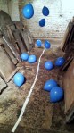
- 115: Artist: EMERALD MOSLEY. Title: Hope / Loss, site specific installation (2013), A site specific installation in The Crypt Gallery, London. Helium filled balloons, nylon covered steel, lead type (Perpetua, 16pt – ‘I remember you’), paper, ink.
-
- 116: Artist: EMERALD MOSLEY. Title: Hope / Loss, site specific installation (2013), A site specific installation in The Crypt Gallery, London. Helium filled balloons, nylon covered steel, lead type (Perpetua, 16pt – ‘I remember you’), paper, ink.
-
- 117: Artist: EMERALD MOSLEY. Title: Hope / Loss, site specific installation (2013), A site specific installation in The Crypt Gallery, London. Helium filled balloons, nylon covered steel, lead type (Perpetua, 16pt – ‘I remember you’), paper, ink.
-
- 118: Artist: EMMA HARVEY, Title: Untitled No8 (2017), 55cm, Oil on board.
-
- 119: Artist: EMMA HARVEY, Title: Untitled No8 (2017), 55cm, Oil on board.
-

- 120: Artist: MIRELLA BANDINI. Title: Disgarded
-
- 121: Artist: MIRELLA BANDINI. Title: Floating Contours, Medium: Ceramic on steel plinths Size: Approximately 1.2 x 1.2 x 1.2m
-
- 122: Artist: MONIKA BANCYR-DEANGELI. Title: Agalmatophilia. The photographs were shot in 2010
-
- 123: Artist: MONIKA BANCYR-DEANGELI. Title: Agalmatophilia. The photographs were shot in 2010
-
- 124: Artist: MONIKA BANCYR-DEANGELI. Title: Agalmatophilia. The photographs were shot in 2010
-
- 125: Artist: MONIKA BANCYR-DEANGELI. Title: Agalmatophilia. The photographs were shot in 2010
-
- 126: Artist: IAN PYPER, Title: Process 2 (2017), A5 marker pen drawing
-
- 127: IAN PYPER – Artist: IAN PYPER, Title: Process 1 (2017), A5 marker pen drawing.
-
- 128: Artist: QUIET BRITISH ACCENT, Title: Here To… Materials: Acryic Paint & 1Shot Signwriters Enamel on Plywood Size: 42cms x 30cms
-
- 129: Artist: TAMSIN CORRIGAN. Title: Untitled (#35) 2016, Medium: Rust and oxidised copper on paper, size: 10 x 7 inches
-
- 130: Artist: SEAN WORRALL: Title: Sometimes They Have Thorns (A Small One 8/43) 2015. Acrylic, marker pen, gloss varnish on canvas, 25cm x 25cm
-
- 131: Artist: SEAN WORRALL: Title: Sometimes They Have Thorns (A Small One 8/43) 2015. Acrylic, marker pen, gloss varnish on canvas, 25cm x 25cm
-
- 132: Artist: SEAN WORRALL: Title: Sometimes They Have Thorns (A Small One 8/43) 2015. Acrylic, marker pen, gloss varnish on canvas, 25cm x 25cm
-
- 133: Artist: SEAN WORRALL: Title: #43ArtDrop, part 13/43 (Dec 2016)
-
- 134: Artist: SEAN WORRALL: Title: Unquiet Slumbers For The Sleepers” – acrylic, brushwork, spray paint on deep edge recycled canvas (150cm x 150cm) 2014/15
NOTES, LINKS AND DETAILS
1: Artist: LAURA SCULL, Title: Cardiff II (2015) – Double print of a range of screen printed drawings and sample paint. Composed of about 6 different layers. (58x63cm)
2: Artist: LAURA SCULL, Title: Untitled (2016) – Experimentation of techniques to create a textured layered surface 29.7cm x 42cm – www.facebook.com/ArtistLauraScull
3: Artist: SZILVIA PONYICZKI, Title: Adventures in Perception II (2017) – acrylic painting on newspaper covered metal sheet. 60 x 60 cm – “Interrogations about the unconscious and the representation of dreams are at the core of my work. The painting is an optical illusion, where the figures of horses are interwoven with the trees around them. This creates interesting phenomena; it is not always clear whether a horse stands in front of another or behind it” – www.ponyiczki.co.uk.
4: Artist: DAY BOWMAN, Title: Rear View Mirror 3 (2017), oil, charcoal and conte on canvas, 152 x 168 cm – “In these works I have set out to investigate how and why we travel the landscapes of Britain that are passed through, ignored or deleted from the collective memory. Whilst the paintings represent snapshots of journeys taken through cities, suburbs, retail parks, parking lots and endless motorways, the rear-view mirror – a constant in the works – represents a two-way mirror of past and future. The mirror comes to represent a gateway, very much in the present, but allowing us to reflect on what has gone before and what might take place. Thus our daily journeys to work, the railway station or retail parks is laid open and the routine criss-crossing the land and our daily lives is brought into focus; journeys which we absorb, acknowledge or ignore. – www.daybowman.com
5: Artist: VERITY NEWMAN, Title: Circle (2016), Acrylic on canvas, 60 x 80cm – “I find myself moving between expressive representational work and abstract work, but more recently I have had the need to explore colour and composition in its purest sense, intuitively and naturally. ‘Circle’ is a result of this process. Blue is the colour I most frequently seek to perfect, either as the main colour or the accent colour, as in this piece, which features Cobalt Blue, hovering, beautifully rich and soft”- www.veritynewman.blogspot.co.uk.
6: Artist: VERITY NEWMAN, Title: Blue Bowl on Red and Red Bottle on Blue (pair) 2015, Acrylic on canvas, 30cm x 30cm (each) – “Part of a still life series exploring our connection to the objects we collect, organise and display in our environments. Some symbolise attachments, to memories and past lives, others reflect a more fleeting need to own something new. The blue bowl was made for me by a colleague as a farewell gift (we have since become good friends) and the red bottle was given to me by my best friend who has since moved on and I no longer have contact with. The symbolism of red against blue is something that features in my work again and again. They are key primary colours that can work together well, but so often jar in temperature, bringing a new power dynamic to a composition” – www.veritynewman.blogspot.co.uk
7/8: Artist: ANGELA McFALL, Title: Sargasso (2016), oil on canvas, 60cm x 60cm. Title: The Sea (2016), oil on canvas – “Sargasso is from a series of paintings exploring place. – “I wanted to capture that feeling of the sea in summertime. Standing on the beach in Nice and looking out at the Mediterranean is a distinct time and place, the shade of blue is like no other. So I wanted to capture this moment and try to contain it. The title Sargasso refers to a sea with no coast, it is a sea within the sea” – http://www.angelamcfall.com
9: Artist: JANE DENMAN. Title: Chunky Move Light (2016), acrylic on canvas This painting is part of a dance and movement series
10: Artist: JANE DENMAN. Title: New Blue Dance (2016), acrylic on canvas, 100cm x 80cm. This painting is part of a dance and movement series
11: Artist: JANE DENMAN. Title: New Feeling (2016), acrylic on canvas. This painting is part of a dance and movement series
12: Artist: JANE DENMAN, Title: Quests Blue (2016), acrylic on canvas. This painting is part of a dance and movement series
13: Artist: JANE DENMAN, Title: Cuban (2015), acrylic on canvas (100cm x 80cm)
www.janedenman.com
14: Artist: PHILL HOPKINS. Title: No.9 (Post Truth), 2016, Household paints and varnish and spray paint on Fabriano 100/100 cotton paper. 28.7 x 19.6cm. “After the turmoil of the Brexit vote, during the build-up to the American election and in the mist of a family struggle, in October 2016 I spent some time on the coast in Pembrokeshire, Wales. I took hundreds of photographs of the empty sea. In an attempt to straighten my mind I edited these down to 65 black and white images. Returning to my studio I started to make paintings based on the photographs. The images and my application of paint became more and more turbulent, increasingly so after the presidential election result. These new paintings are called the ‘Post Truth’ series, currently numbering over 35 works. They are made on thick Fabriano paper that I was given, using household paints and varnishes, spray paint and what comes to hand” – www.phill-hopkins.co.uk.
15: Artist: PHILL HOPKINS, Title: Untitled (Mark Rothko by Hans Naumuth 1964) 2017, Paints, varnishes, drips, marks and studio debris on postcard, 10.5 x 14.8cm
– www.phill-hopkins.co.uk.
16/17: Artist: SHARLEENE OLIVIER, Title: Stormy Sea (2017), Paper, thread, 42cm x 60cm. Layers of paper stitched together, cut and re-stitched by hand to create a textured artwork – sharleeneblog.wordpress.com
18: Artist: MARION JONES, title: Powder Blue (2016). Oil, acrylic, graphite and pigment on canvas, 102 x 76cm. Layers , edges, planes and geometric shapes. www.marionjones.co.uk.
19: Artist: SUSAN BANKS. Title: Persephone [Among Torches of Darkness] no 1 (2011), Oil paint on deep canvas, 60x60x4cm
20: Artist: SUSAN BANKS. Title: Persephone [Among Torches of Darkness] no 2 (2011), Oil paint on deep canvas, 76x76x4cm – “Persephone [Among Torches of Darkness] # 1 eludes the usual narrative of serial victimhood associated with myth and depictions of abduction and implies that some aspects of the underworld could be relished. Elements of the painting were suggested by the poem Bavarian Gentians by D H Lawrence”.No2 is in the show because I rather wanted more than one piece from Susan. www.axisweb.org/p/susanbanks / Facebook
21 22, 23: Artist: SIMON LE BOGGIT. Title: Tangled Up In Blue (2017). Three photos of a glazed ceramic sculpture, H 10cm x W12cm x D 10cm – Simon has not provided a website link.
24, 25, 26: Artist: EMILIE-CHRISTINE P. NEWMAN, Title: Mitailak (2013), Encaustic, stained glass, lightbox, 20cm x 25cm x 2.5cm. All three images are of the same piece, from different angles. “Mitailak is part of the series Immaterial Instances. These three-dimensional works are created by painting encaustic onto stained glass in a process of creation that is somewhat akin to automatic writing or stream of consciousness wherein subconscious thoughts and emotions dictate the artist’s body’s movements as it applies the wax to glass rather than coming to it with specifically planned ideas of the finished work. The results are warped, non-figurative microcosmic worlds, each of which act as both escapes from and analogues to the artist’s conscious, subconscious, and physical self. In a gallery setting, these works are displayed on plinths of varying heights, containing light boxes. They are meant to be explored from many angles, including from the top and at eye level since the works transform and reveal different meanings as they are viewed in different ways” – www.christinepnewman.com.
27: Artist: KRISTY CAMPBELL, Title: Artist Books, Assemblage (2014). Kristy has not given us a website link.
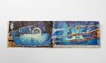
28, 29, 30: Artist: SUSAN WRIGHT. Title: Canticle for the Anthropecene (2017), Print – etching, monoprints and photolithography presented in the form of a bound book. 30cm x 40cm x 5cm – “This is a piece of work which I submitted for an exhibition ‘Telling in Full’, part of the Words festival at Lancaster University (Lancaster Arts) in July 2017. It was a call for artwork which responded to a specfic piece of text. The text that I drew inspiration from for this work was ‘A Canticle for Leibowitz’ by Walter M. Miller. It was realised as a series of A3 etchings on handmade paper which were then made up into a book with a fibreboard cover. The etchings have imagery from the text collaged on to them. They also were coloured by dipping in iron oxide solution and have details highlighted in gold ink. Mono print techniques and Photo Lithograpghy were used to print the details on the cover and the book was sewn using a coptic stitch” Web: suegrantwright.co.uk
31: SEAN WORRALL, observations with a camera. A shot taken at A Fete Worse Than Death 2014, Rivington Street, East London, A 20th Anniversary Art extravaganza to commemorate the original Fete and to celebrate Joshua Compston.
32 – 35: Artist: JOANNA LEAH, Title: It’s So Serious Doing The Twist (2016), Images from Diptych film presented at KTH Institute Stockholm. – “’It’s So Serious Doing the Twist’ (from joanna leah’s ‘blubilds’) takes domestic apparatus such as stairs and cut off newel posts as apparatus for the body to fall, twist and balance into an expression of feminine boredom with domestic interiors and a new activity for Edgelands (waste urban/rural zones). The images submitted are a mix of the apparatus, performance and stains taken from Part 2 of ‘It’s So Serious Doing The Twist’. – www.joannaleah.co.uk / afternature.co.uk
36: Artist: SUSAN PLOVER, Title: Blue For You (2017), Collage, 12.5 x 18cms – “A minimalist piece evolved from fragments of found images . Blue refers to the hue and intent of the narrative”- www.susanplover.com.
37: Artist: SUSAN PLOVER. Title: In my dreams (2017). Drawing; Paper on card. 18 x 12.5cm – www.susanplover.com
38: Artist: ALICE MARTIN. Title: AMO1 (2016), Digital art, 22 x 30cm – “The idea was to investigate the different ways in which to interrogate an object. The flatbed scan technique which I have applied allows all angles to be on display. Whilst at the same time highlighting the detail involved. AM01 is from my Archive Boxes installation which consisted of six archive boxes storing a wealth of information based on six objects, collected from various charity shops in Aberdeen, Scotland. The intention was to explore the idea of value and engagement through a tangible experience. With a focus on ordinary, mundane objects. Therefore through an over-anaylsis, it could be argued that value has ultimately been added, which is why I decided in the end to put the artefacts back into the public domain” – www.cargocollective.com/alicecmartin.
39 – 42: ZOOX. Title: float; (2017), Video – stills from a video from the Zoox collective. “We were invited to take part in Creative Reactions, an initiative to connect scientists with artists. This series was developed during our collaboration and exhibited as part of the Pint of Science festival in London, 2017. We were partnered with Dr. Gabriele Sosso at the London Centre of Nanotechnology, whose main focus of research is to study how water freezes. Whilst visiting Gabriele we were particularly fascinated to learn that as a theorist he only builds computational models as opposed to studying any physical materials. We explored this idea of simulating water through code to develop a live visualisation of the data points of the potential energy of Gabriele’s virtual water as it freezes. We were very interested in the practical implications of Gabriele’s research, for example how his data can inform climate change research, the freezing of organs for donation, improving crop production and how to develop a water supply when we colonise Mars. We referenced these applications in developing our visuals, by taking 3D models of an iceberg, a heart, oats and the planet Mars, and manipulating their movement and aesthetics with the potential energy data. As Gabriele’s virtual water freezes (and the potential energy becomes lower), the movement of the 3D models becomes less volatile, and their true form becomes more visible. For this exhibition we would like to submit the iceberg video of the series. The images attached are video stills” – www.zoox-collective.com
43: Artist: MONICA GOLDSTEIN. Title: Book of Space. (artist book). Unique book.(1989), Altered book, 18 pages (collage, ink, colour pencils), 24 cm x 14 cm x 1 cm (closed). “This is one of my first artist books. As long as I can remember, I have lived surrounded by books. Using the book format was a natural artistic evolution for me as my paintings in the 1980s were configured through various techniques on paper. At that moment the book was just a change in support” – monicagoldstein or see more of the artists books via vimeo.com.
44: Artist: MONICA GOLDSTEIN, Title: Subtle Geography Treaty (artist book) 1997, Unique Book. Altered book. Mixed media, 20 cm x 28 cm x 8 cm (closed). “…….I made two inner spaces, in one of them a character with a yoga posture called Gokilasana lives and, in the other, there is a blue rose. At the beginning I looked for a white rose and then, a blue one appeared” – – monicagoldstein or see more of the artists books via vimeo.com.
49: Artist: MARK PARKINSON, Title: Untitled (2017), oil on mdf, 10x10x10cm
50: Artist: MARK PARKINSON, Title: Avenham Nights (2015), oil on canvas, 120x80x4cm
51: Artist: MARK PARKINSON, Title: On The Edge (2014), oil on canvas, 120x80x4cm
52: Artist: MARK PARKINSON, Title: Quite Before Dawn (2015), oil on canvas, 120×80 x4cm – “Living on inner city estates has heavily influences his work, drawing on experiences, memories and a sense of place, within it notions of working class identity. The imagery in his work is driven by responses to situations and cognition. His latest paintings use geometric shapes and colour to investigate fear, anxiety, stress and the constraints of living within these estates, the memories that taint his past and effect his future” – markeparkinson
53: Artist: CATHERINE HIGHAM. Title: Hunshelf (Snow), 2015. Acrylic and oil on canvas, 61 x 61cm – “My work is concerned with the materials and processes of landscape; both natural and fabricated. Land form, surface and space; water; vegetation; light; weather; built structures; habitats (for humans/wildlife); time & change are central elements of my practice as an artist. This painting aims to capture a the winter morning light following a new snow fall. Although rooted in ‘landscape’ my current artwork investigates ideas of representation and relational aspects of form and non-form; figure and ground; precision and spontaneity; absence and presence. Methods of working involve deliberate actions (application of marks, tone and poured paint) and serendipity (allowing the materials to follow their own request). As with landscape, the resulting artwork is simply a record of its own making” www.cjhigham.com
54: SEAN WORRALL, observations with a camera. A shot of a chalk drawing on a Hackney Pavement, June 2017. Artist unknown
55: Artist: SANDRA BECCARELLI. Title: Mercurial Light (2016), Oil on linen, 40cm x 40cm – “A hidden grid under the blue paint, visible only in parts decided whete I would place the tones of grey. Overlaying this, the hidden grid re- emerges and is painted with Vermillion, the colour created from mercury. This highly toxic and rare paint was coveted by the old masters. I chose to use it as another quality of mercury which is forever changing and fluid. These themes of movement and change are constant themes within all my works” – sandrabeccarelli.co.uk
56: Artist: SANDRA BECCARELLI Title: An Uncertain Place. (2016), Oil on linen, 40cm x 40cm – “This piece is about creating a system as a catalyst for randomness. Underneath the blue is a grid which was only visible in some places after rolling on the paint. These areas became the parts for my tonal explorations of light and dark shades, ranging from white to the darkest of greys” – sandrabeccarelli.co.uk
57: Artist: ROBERT P. RYAN Title: Covered (2017), oil on canvas, 30″ x 40″ – “Here’s a mesh of artist’s statement and description of this piece: In Victorian photography mothers needed to hold their children still to accommodate the lengthy exposure times. An interesting development in this period was the attempt to conceal the mother’s presence from the shot. They were draped in fabric in order to appear as a backdrop or as furniture. This piece, as well as other works of mine, focuses on these figures. Their disturbing, anonymous appearance has the look of a traditional sheet covered ghost, yet they are also representative of the mother/child connection. Foreign and familiar, this piece looks at the distortion and break in that connection. The pursuit of a female contact and how that manifests itself as a sexual desire is also of interest here. This element is represented by bare breasts which can be either maternal or erotic. The lack of any other identifying features obfuscates how this “nude” should be interpreted” facebook.com/robertpryanart
58: Artist: WAYNE SLEETH Title: Gulls (2013), acrylic and gloss paint on stretched canvas, 100 x 80cm
59: Artist: WAYNE SLEETH Title: Gulls (2015), acrylic and gloss paint on stretched canvas, 80 x 80cm
60: Artist: WAYNE SLEETH Title: Gulls (2014), acrylic and gloss paint on stretched canvas, 100 x 100cm
61: Artist: WAYNE SLEETH Title: Gulls (2016), acrylic and gloss paint on stretched canvas, 70 x 50cm
– Wayne is “a British fine artist based in France since 2000, working and exhibiting on both sides of the Channel” – www.waynesleeth.com
62: Artist: CHARLOTTE NICHOLSON, Title: Lady In Blue (2016), Polychromatic print, 69cm x 90cm – “In my artwork I challenge ideas of the male gaze, voyeurism and how women have been perceived as consumable objects. My polychromatic print, Lady in Blue, symbolises the depression and anxiety that+ everyday objectification of women takes its toll on everyday people. The black shows the suppression of women, whilst the blue is symbolic of hope and lighter times to come” – http://www.nicholsonart.co.uk.
63: Artist: GEORGINA MAXWELL, Title: Toxic Ocean Blues (2013), Marine plastic bottle tops found on the shorelines of Cornwall, 43 x 36 x 7cm, white box framed. www.georginamaxwell.org
64: Artist: BEATA BURDELAK Title: On View (2016), ink and acrylic on wood, carpet, tea and resin.
65/66: Artist: BEATA BURDELAK Title: Blue Bird (2015), resin, towels, size: Variable
67: Artist: BEATA BURDELAK Title: Would it have Been Worth it After All (2015), ink and acrylic on wood, cast iron
58/69: Artist: BEATA BURDELAK Title: Not Quite There
– “My work is a way of mapping and connecting with my environment during each moment of its existence. I work with the objects and materials around me, incorporating my own language into the process of reconstruction to present them as something related to my immediate experience. There is something more to life than the material, which can only be sensed in its absence. But being aware of it, in its absence, has the potential to change our perception of reality” – www.beataburdelak.com.
70/73: Artist: JOE JEFFORD, Title: 470-495 nm (2014), Cyanotype Print, 60cm x 85cm, Cyanotype prints are inherently linked with the colour blue. It was the first process used to created engineering blueprints – “Cyanotype prints are inherently linked with the colour blue. It was the first process used to created engineering blueprints (named so because of the colour left by the photosenstive chemicals once exposed to UV light) and is considered one of the earliest photographic techniques. In this series of prints I wanted to use this process to make abstract works that still hinted at the history of the method. The paper was creased before printing to give the impression of structures and forms that look like a map or diagram. The title of the series is a reference to the wavelength of light that represents prussian blue, the dye that gives cyanotyping its colour” – joewilliamjefford.tumblr.com.
74: Artist: LINDA PARR, Title: Blue Eyes (2013), LetterMpress digital print, 36 x 26.5cm. Blue four-letter word poem – “I work with text and image, I enjoy how an artist’s approach to text can alter the way we read”. – www.lindasusanparr.com
75/78: Artist: HEIDI WIGMORE, Title: Blue Movie (2017), Drawing on paper, 29cm x 42cm. An ongoing series of fast sketches from life, that make a looped slideshow-movie of performing strippers and pole dancers – heidiwigmore.co.uk
79/81: Artist: HARRIET HILL. Title: Big Drip (2013), hand-cut vinyl, Site-specific installation on the windows of a house – heidiwigmore.co.uk
82: Artist: HARRIET HILL. Title: Flop (2016), canvas on timber, 170 x 92 x 7cm. Letters cut out of blue canvas mounted on timber frame – heidiwigmore.co.uk
83/84: Artist: HARRIET HILL. Title: Matter (2016), canvas on timber, 170 x 92cm. Letters cut out of blue canvas mounted on timber frame – heidiwigmore.co.uk
85: Artist: CATHERINE RYAN, Title: Illuminati City (It’s OK Baby) 2011, Acrylic and mixed media on canvas, 82 x 82cm – “I decided to simplify my work in this piece by using a palette of blue. Illuminati or Blue City is an intimidating place, home to sharks, a bad doctor (Dr Mal), a grotesque cyber chicken and a lone figure surrounded by the watery shopping mecca. Shards of mirror invite the outside world in. EU stars break free. There is space at the top of the skyline, for things to breathe” www.catherineryanart.com
86/87: Artist: JAWBONE JAWBONE, Title: Where? (2017), plywood, aeroply & varnish, H – 1m 20cm W – 1m 60cm D – 12cm – “Artistically we collaborate through our third identity, jawbone jawbone. As habitual re-users of imagery we aim to generate motifs that appear in various forms. We are interested in taking elements from previous works and jostling them around to inform new works. In this way we refer to a lot of our work as elements, rather than their more specific medium. This approach allows us to push motifs to see how far they can stretch and morph. www.jawbonejawbone.com
88: Artist: HEATHER BOXALL, title: Blue Icon (2015), oil on gesso on board, 30cm x 30cm. “Part of a series of blue monochromes that explored the symbolism of blue. ‘Blue Icon’ is a homage to Malevich’s black square” – www.axisweb.org/p/heatherboxall.
89/90/91: Artist: HEATHER BOXALL, title: marion blue l/ll/lll (2015-16), oil on gesso on board, 30cm x 25cm – “A small series of works exploring the blue pigments as represented in the religious paintings of the Renaissance. The Virgin Mary was often painted with most expensive pigment, Lapis Lazuli. Using glazing techniques, the colour is built up using oil prepared lapis lazuli pigment and other closely related colours” – www.axisweb.org/p/heatherboxall
92: Artist: AMANDA WATT, title: Blue nude. Acrylic on board, 8”x5” – www.amandawatt.co.uk
93: Artist: ANDREW LITTEN. Title: Nothing Matters (2017), oil on board, 45x60cm – http://andrewlitten.com
94/95: Artist: ANGELA READ. Title: Three Towers (2015). Process based work made from discarded aluminium drinks cans which have been manipulated into an origami shape. – www.angelaread.co.uk / www.facebook.com/angelareadart
96: Artist: ANDREW LITTEN. Title: Man (Standing) 2017, 100 x70cm, mixed media on paper – http://andrewlitten.com
97/99: Artist: ALEXANDER GLASS, title: ‘…and then the towel fell to the floor’ (2015), jesmonite, steel, resin coated towel, 100 x 40 x 50 cm – “The work depicts a moment of seduction, the act before an event”. www.alexanderglasssculpture.com
100: Artist: BARBARA BRYN KLARE, Title: Blue Rock Medium: Ink on paper, 8×9″
101: Artist: BARBARA BRYN KLARE, Title: Blue Horizon Medium: Gouache and ink on paper, 18×24″
102: Artist: BARBARA BRYN KLARE, Title: Indigo Landscape, Medium: Filtered indigo-dyed paper, 18 x 24 inches. My website is here: barbarabrynklare and my solo show on my fascination with the colour blue (ICELAND :: blue) is here
103: Artist: CAIT SWEENEY, Title: View From A Hill, Brill, Bucks. Oil on board, 129x90cm – www.caitsweeney.com
104/106: Artist: DARIA WAWRZKIEWICZ, Title: ‘Drifting’, paper/sculpture performance with light 6am –“in space of light. like thought thrown to the ground. they are drifting looking for direction – facebook.com/daria.wawrzkiewicz
107: Artist: BARBARA BRYN KLARE, Title: Rams Horns Medium: Icelandic ram horn cartilage, indigo-dyed thread, 20 x 10 inches – barbarabrynklare.com
108/110: Artist: DEB COVELL, Title: Blue Pleat (2017), Acrylic paint, car lacquer, 16×24 cm – www.debcovell.co.uk
111: Artist: DORA WILLIAMS. Title: Emotional Revolution – acrylic on canvas size 40 x 40 inches –
112: Artist: DORA WILLIAMS. Title: On the Edge 2 – Acrylic on Canvas – 36 x 48 inches
113: Artist: DORA WILLIAMS. Title: Standing Figure – Acrylic on paper, 59cm x 84cm
www.dorawilliamsfineart.com
114: Artist: EMERALD MOSLEY / CHRISTINA BALLARD. Title: World Water Week installation (2012). A piece that was on the roof terrace of the Coq ‘Argent restaurant in London. – http://goldtop.org
115/117: Artist: EMERALD MOSLEY. Title: Hope / Loss, site specific installation (2013), A site specific installation in The Crypt Gallery, London. Helium filled balloons, nylon covered steel, lead type (Perpetua, 16pt – ‘I remember you’), paper, ink. http://goldtop.org/making/hope-loss/
118/119: Artist: EMMA HARVEY, Title: Untitled No8 (2017), 55cm, Oil on board. – The eight in an ongoing series of paintings on 55cm circular boards, part of an ongoing series that has been evolving since the start of 2016 – “Emma Harvey’s work explores themes of sexuality and the place of women in contemporary society within a culture that overally sexualises women. Emma creates very personal responses to gender and female sexuality and her own understanding of body, femininity, and self”. – www.evh-art.co.uk
120: Artist: MIRELLA BANDINI. Title: Disgarded
121: Artist: MIRELLA BANDINI. Title: Floating Contours, Medium: Ceramic on steel plinths Size: Approximately 1.2 x 1.2 x 1.2m – www.mirellabandini.com
122/125: Artist: MONIKA BANCYR-DEANGELI. Title: Agalmatophilia. The photographs were shot in 2010 – “The title of the project is Agalmatophilia. The photographs were inspired by the emotional or/and physical relationships people have with objects of their desires. The project was shot in 2010 You can see more of my work here monikabancyrdeangeli
126/127: Artist: IAN PYPER, Title: Process 1/2 (2017), A5 marker pen drawing
128: Artist: QUIET BRITISH ACCENT, Title: Here To… Materials: Acryic Paint & 1Shot Signwriters Enamel on Plywood Size: 42cms x 30cms – “Quiet British Accent is an artist duo. We began working together in 2011 and use a variety of signwriting and sewing techniques to explore our love of lettering, language and pop culture. We also paint fake expansions of our QbA acronym on old pennies and leave them on the streets for people to find. Over the past six years, we’ve exhibited regularly, been featured by the likes of The Guardian, Design Week & Cool Hunting, taken part in the annual Art Car Boot Fair, worked on various commissions and workshops, and dropped a lot of pennies”.- www.quietbritishaccent.com
130/132: Artist: SEAN WORRALL: Title: Sometimes They Have Thorns (A Small One 8/43) 2015. Acrylic, marker pen, gloss varnish on canvas, 25cm x 25cm – One of a series of 43 small thorny leaf paintings. www.seanworrall.net
133: Artist: SEAN WORRALL: Title: #43ArtDrop, part 13/43 (Dec 2016) – One of 43 paintings on things found on the street, and left hanging on the streets of London and Birmingham back in December 2016 for people to take should they wish to – www.seanworrall.net
134: Artist: SEAN WORRALL: Title: Unquiet Slumbers For The Sleepers – acrylic, brushwork, spray paint on deep edge recycled canvas (150cm x 150cm) 2014/15. And evolving piece of growth, fresh layers on an old canvas that was originally left at the gallery during my art depository week that invited people to leave old unwanted unresolved paintings so that fresh layers could grow on them. This piece has evolved several times as more leaves grow, I have no idea who left the original canvas painted blue and back at the gallery, it was left with a message but no name and was waiting there before we opened. – www.seanworrall.net

Reblogged this on Sharleene Olivier.